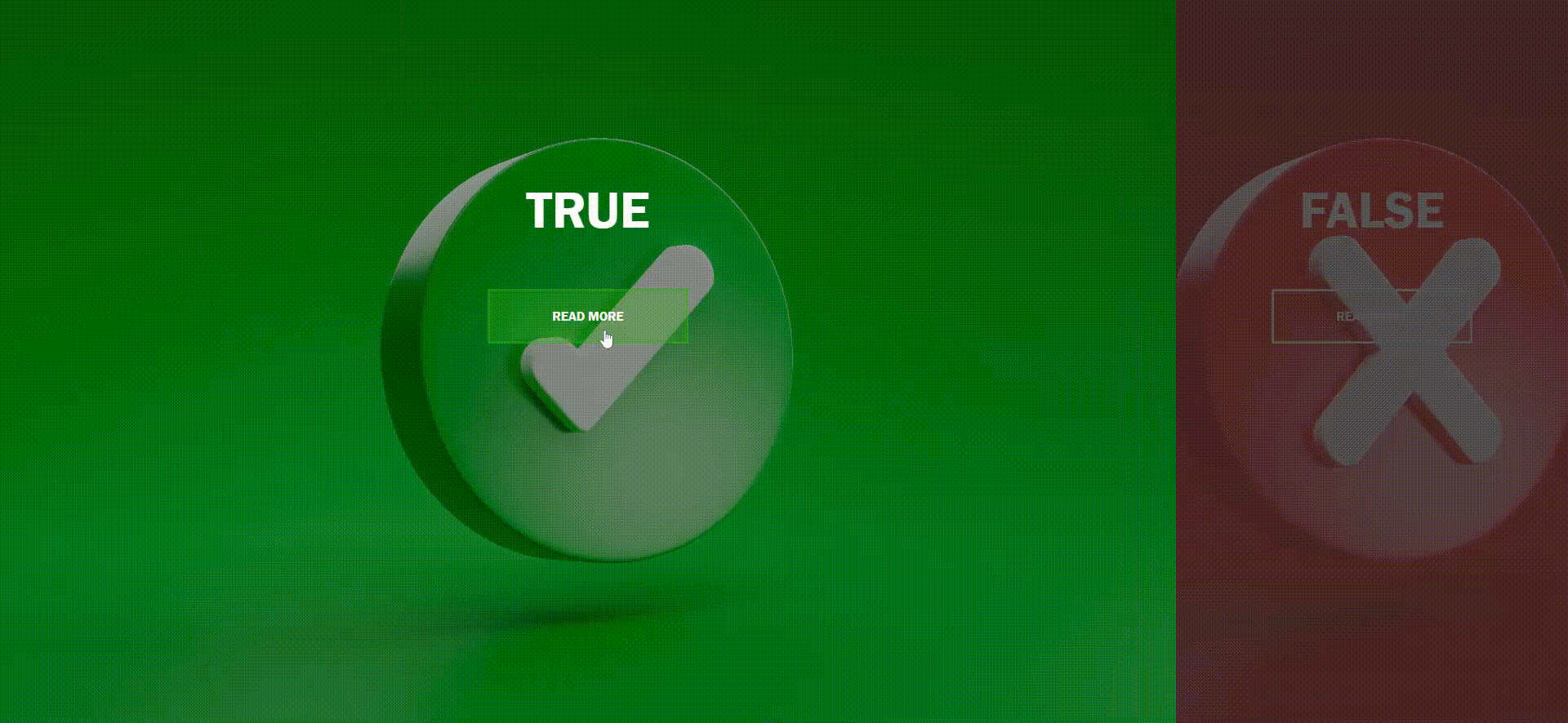
In this blog post, we’ll explore the creation of an enticing split-screen landing page using HTML and CSS. This code offers a detailed look at how to design an interactive web page that captures user attention and provides a delightful browsing experience.
## HTML Structure
The HTML structure commences with the standard document declaration, including a <head> section for metadata and a reference to an external CSS file. Within the <body> of the page, there is a <div> element with a class of “container” that acts as the main content wrapper. Inside this container, two <div> elements with classes “split left” and “split right” represent the left and right halves of the split screen, respectively.
Each split <div> contains an <h1> element displaying “TRUE” and “FALSE” headings, accompanied by an anchor (<a>) element with the class “button” labeled “Read More.” These elements play a crucial role in presenting content and creating interactive links.
<!DOCTYPE html>
<html lang="en" >
<head>
  <meta charset="UTF-8">
  <title>Split screen landing - Target Media Agency</title>
  <link rel="stylesheet" href="./style.css">

</head>
<body>
<div class="container">
  <div class="split left">
    <h1>TRUE</h1>
    <a href="#" class="button">Read More</a>
  </div>
  <div class="split right">
    <h1>FALSE</h1>
    <a href="#" class="button">Read More</a>
  </div>
</div>
  <script  src="./script.js"></script>

</body>
</html>
## JavaScript Interactivity
The JavaScript code section introduces interactivity to the split screen. It starts by selecting the .left, .right, and .container elements using document.querySelector. Event listeners are then attached to the .left and .right elements, triggering “mouseenter” and “mouseleave” events that create a hover effect on both sides of the split screen. When a user hovers over either side, the .hover-left or .hover-right class is added to the .container element, initiating CSS transitions and animations.
const left = document.querySelector(".left");
const right = document.querySelector(".right");
const container = document.querySelector(".container");

left.addEventListener("mouseenter", () => {
  container.classList.add("hover-left");
});

left.addEventListener("mouseleave", () => {
  container.classList.remove("hover-left");
});

right.addEventListener("mouseenter", () => {
  container.classList.add("hover-right");
});

right.addEventListener("mouseleave", () => {
  container.classList.remove("hover-right");
});
## CSS Styling
The CSS section defines the visual style and layout of the split-screen landing page. Key aspects include:
- Custom CSS variables (e.g.,
--container-bg-color,--left-bg-color,--left-button-hover-color,--right-bg-color,--right-button-hover-color) facilitate easy theming and customization of the page’s appearance. - Minimal default styling for
<html>and<body>elements ensures a clean and responsive layout, with horizontal overflow hidden to prevent unwanted scrolling. <h1>elements are styled with a substantial font size, positioned at the top of each split screen half, and centered horizontally usingtransform: translateX(-50%). The use ofwhite-space: nowrap;ensures text remains on a single line.- Buttons with the class
.buttonare styled with centered positions and hover effects that alter background and border colors, enhancing interactivity. - The
.splitclass represents each split screen half, usingposition: absolutefor side-by-side layout and applying background images viabackgroundandbackground-size: coverfor visually appealing backgrounds. - Pseudo-elements (
::before) create semi-transparent overlays on each split screen half, enhancing readability and visual appeal. - Transitions are applied to various elements, delivering smooth animations when users interact with the split screen.
:root {  --container-bg-color: #333;  --left-bg-color: rgb(0 0 0 / 40%);  --left-button-hover-color: rgb(47 185 14 / 30%);  --right-bg-color: rgba(43, 43, 43, 0.8);  --right-button-hover-color: rgba(161, 11, 11, 0.3);  --hover-width: 75%;  --other-width: 25%;  --speed: 1000ms;}

html, body {  padding:0;  margin:0;  font-family: 'Franklin Gothic Medium', 'Arial Narrow', Arial, sans-serif;  width: 100%;  height: 100%;  overflow-x: hidden;}

h1 {  font-size: 4rem;  color: #fff;  position: absolute;  left: 50%;  top: 20%;  transform: translateX(-50%);  white-space: nowrap;}

.button {  display: block;  position: absolute;  left: 50%;  top: 40%;  height: 2.5rem;  padding-top: 1.3rem;  width: 15rem;  text-align: center;  color: #fff;  border: #fff solid 0.2rem;  font-size: 1rem;  font-weight: bold;  text-transform: uppercase;  text-decoration: none;  transform: translateX(-50%);}

.split.left .button:hover {  background-color: var(--left-button-hover-color);  border-color: var(--left-button-hover-color);}

.split.right .button:hover {  background-color: var(--right-button-hover-color);  border-color: var(--right-button-hover-color);}

.container {  position: relative;  width: 100%;  height: 100%;  background: var(--container-bg-color);}

.split {  position: absolute;  width: 50%;  height: 100%;  overflow: hidden;}

.split.left {  left:0;  background: url('true.jpg') center center no-repeat;  background-size: cover;}

.split.left:before {  position:absolute;  content: "";  width: 100%;  height: 100%;  background: var(--left-bg-color);}

.split.right {  right:0;  background: url('false.jpg') center center no-repeat;  background-size: cover;}

.split.right:before {  position:absolute;  content: "";  width: 100%;  height: 100%;  background: var(--right-bg-color);}

.split.left, .split.right, .split.right:before, .split.left:before {  transition: var(--speed) all ease-in-out;}

.hover-left .left {  width: var(--hover-width);}

.hover-left .right {  width: var(--other-width);}

.hover-left .right:before {  z-index: 2;}


.hover-right .right {  width: var(--hover-width);}

.hover-right .left {  width: var(--other-width);}

.hover-right .left:before {  z-index: 2;}

@media(max-width: 800px) {
  h1 {
    font-size: 2rem;
  }

  .button {
    width: 12rem;
  }
}

@media(max-height: 700px) {
  .button {
    top: 70%;
  }
}
## Responsive Design
Media queries are included to ensure the design adapts to various screen sizes. For instance, when the screen width is below 800 pixels, font sizes and button dimensions are adjusted to maintain a pleasing layout. Additionally, when the screen height is less than 700 pixels, the position of the .button elements is adjusted for improved display on smaller screens.
## Conclusion
This HTML and CSS code serves as a blueprint for creating an engaging split-screen landing page with interactive elements. Utilizing CSS variables and transitions, you can effortlessly tailor the visual style to match your branding or design preferences. A split-screen layout is a compelling choice for presenting two distinct options or content pieces on a single page, making it a valuable addition to your web development arsenal.
GET IN TOUCH