In today’s web development, creating visually appealing and responsive components is essential to engage users effectively. In this blog post, we’ll dive into a code example that demonstrates how to build an animated and responsive card using HTML and CSS.
##HTML Structure
Let’s start by examining the HTML structure of our animated card:
<!DOCTYPE html>
<html lang="en" >
<head>
<meta charset="UTF-8">
<title>Animated Responsive Card - Target Media Agency</title>
<link rel="stylesheet" href="./style.css">
</head>
<body>
<body>
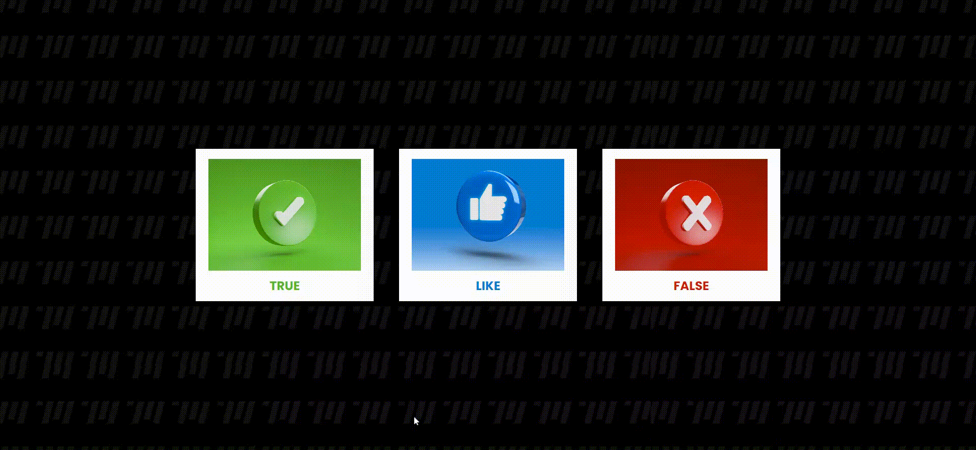
<div class="container">
<div class="card" style="--clr: #59b527">
<div class="img-box">
<img src="https://i.postimg.cc/7ZPr1gm8/true.jpg">
</div>
<div class="content">
<h2>TRUE</h2>
<p>
Lorem ipsum, dolor sit amet consectetur adipisicing elit.
Architecto, hic? Magnam eum error saepe doloribus corrupti
repellat quisquam alias doloremque!
</p>
<a href="">Read More</a>
</div>
</div>
<div class="card" style="--clr: #007dd3">
<div class="img-box">
<img src="https://i.postimg.cc/br7tYss3/like.png">
</div>
<div class="content">
<h2>LIKE</h2>
<p>
Lorem ipsum, dolor sit amet consectetur adipisicing elit.
Architecto, hic? Magnam eum error saepe doloribus corrupti
repellat quisquam alias doloremque!
</p>
<a href="">Read More</a>
</div>
</div>
<div class="card" style="--clr: #d01e00">
<div class="img-box">
<img src="https://i.postimg.cc/jd4rJ864/false.jpg">
</div>
<div class="content">
<h2>FALSE</h2>
<p>
Lorem ipsum, dolor sit amet consectetur adipisicing elit.
Architecto, hic? Magnam eum error saepe doloribus corrupti
repellat quisquam alias doloremque!
</p>
<a href="">Read More</a>
</div>
</div>
</div>
</body>
</body>
</html>
This HTML structure defines a container for our cards. Inside the container, we have three cards, each with a unique background color, an image, a title, some text content, and a “Read More” link. These cards are styled using CSS.
##CSS Styling
Let’s take a closer look at the CSS styling used to create the animated and responsive card:
@import url('https://fonts.googleapis.com/css2?family=Poppins:wght@200;300;400;500;600;700;800;900&display=swap');

* {
 margin: 0; padding: 0; box-sizing: border-box; font-family: 'Poppins', sans-serif;}

body {
 display: flex; justify-content: center; align-items: center; min-height: 100vh; background-image:url("https://i.postimg.cc/bJVhddQc/back-Target.png");
}

.container { position: relative; display: flex; justify-content: center; align-items: center; flex-wrap: wrap; gap: 100px 50px; padding: 100px 50px;}

.container .card { position: relative; display: flex; justify-content: center; align-items: flex-start; width: 350px; max-width: 100%; height: 300px; background: white; transition: 0.5s;   box-shadow: 0 35px 80px rgba(0, 0, 0, 0.15);}

.container .card:hover { height: 400px;}

.container .card .img-box { position: absolute; top: 20px; width: 300px; height: 220px; background: #333; overflow: hidden; transition: 0.5s;}

.container .card:hover .img-box { top: -100px; scale: 0.75; box-shadow: 0 15px 45px rgba(0, 0, 0, 0.2);}

.container .card .img-box img { position: absolute; top: 0; left: 0; width: 100%; height: 100%; object-fit: cover;}

.container .card .content { position: absolute; top: 252px; width: 100%; height: 35px; padding: 0 30px; text-align: center; overflow: hidden; transition: 0.5s;}

.container .card:hover .content { top: 130px; height: 250px;}

.container .card .content h2 { font-size: 1.5rem; font-weight: 700; color: var(--clr);}

.container .card .content p { color: #333;}

.container .card .content a { position: relative; top: 15px; display: inline-block; padding: 12px 25px; text-decoration: none; background: var(--clr); color: white; font-weight: 500;}

.container .card .content a:hover { opacity: 0.8;}

@media (max-width: 480px) { .container .card {  width: 230px;  border-radius: 15px; }

 .container .card .img-box {  width: 185px;  border-radius: 10px; }

 .container .card .content p {  font-size: 0.8rem; }

 .container .card .content a {  font-size: 0.9rem; }
}
Here’s a breakdown of the key CSS components used in our card design:
- We import the Google Fonts ‘Poppins’ to style our text content.
- We apply some global styles to reset margins, padding, and set the font family.
- The
bodyis centered both horizontally and vertically with a background image. - The
.containerholds our cards, aligns them, and adds some spacing between them. - Each
.cardhas a background color and transitions on hover to create an animation effect. - The
.img-boxinside each card creates a container for the image with a hover effect. - The
.contentsection contains the title, text, and a link to read more. - Media queries are used for responsive design, adapting the card size and text size for smaller screens.
##Conclusion
Building animated and responsive cards like the one we’ve created in this example can greatly enhance the visual appeal of your website or web application. These cards are effective for displaying information or showcasing products in an engaging and user-friendly manner. You can further customize and expand upon this design to suit your specific project needs. Happy coding!
GET IN TOUCH