In this blog post, we’ll dissect and analyze a sleek and modern toggle switch built using HTML and CSS. This toggle switch not only serves as a functional UI element but also demonstrates the power of CSS for creating engaging user interfaces.
## HTML Structure
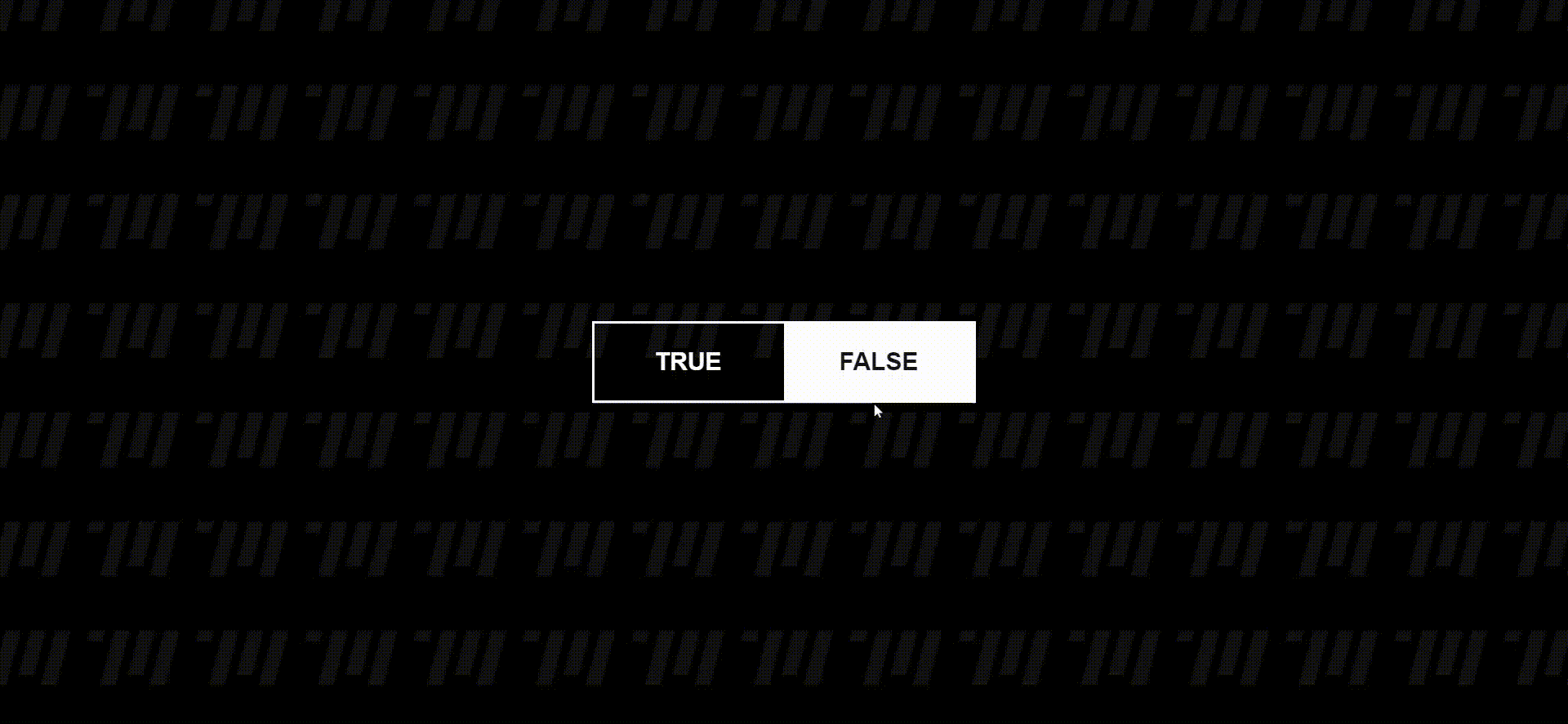
The HTML structure begins with the standard document declaration and includes a `<head>` section with metadata and a reference to an external CSS file. The `<body>` contains a `<div>` with a class of “container” to center-align its contents. Inside this container, there is a `<form>` element with a class of “toggle.”
Within the form, two radio input elements with unique IDs (`choice1` and `choice2`) and corresponding labels are defined. These radio buttons provide the core functionality of the toggle switch. A `<div>` with the ID “swap” wraps around a `<span>` element with the class “content,” which displays the selected option. This structure enables the animation of the toggle switch.
Finally, a `<script>` tag references an external JavaScript file for handling user interactions.
<!DOCTYPE html>
<html lang="en" >
<head>
  <meta charset="UTF-8">
  <title>Swap Toggle - Target Media Agency</title>
  <link rel="stylesheet" href="./style.css">

</head>

<body>

<div class="container">

<form class="toggle">

<input type="radio" id="choice1" name="choice"

value="creative">

<label for="choice1">TRUE</label>

<input type="radio" id="choice2" name="choice" value="productive">

<label for="choice2">FALSE</label>

<div id="swap"><span class="content">productive</span></div> </form>

</div>
  <script  src="./script.js"></script>

</body>
</html>
## JavaScript Functionality
The JavaScript code defines an object named `st` to store references to various DOM elements. These references are obtained using `querySelector` and are stored for later use.
The code sets up an event listener on the “transitionend” event of the `#swap` element. Depending on the selected radio button, the toggle switch rotates using CSS transforms. A timeout function resets the transform property after a smooth transition.
Additionally, there is a `clickHandler` function that updates the text content of the “swap” element when a radio button’s corresponding label is clicked. This function ensures that the text reflects the currently selected option.
Two more event listeners are added to handle the initial state when the page loads and to respond to clicks anywhere on the document. These listeners invoke the `clickHandler` function when a label is clicked, updating the display accordingly.
const st = {};

st.swap = document.querySelector("#swap");

st.toggle = document.querySelector(".toggle");

st.choice1 = document.querySelector("#choice1");

st.choice2 = document.querySelector("#choice2");

st.swap.addEventListener("transitionend", () => {

  if (st.choice1.checked) {

    st.toggle.style.transform = "rotateY(-15deg)";

    setTimeout(() => (st.toggle.style.transform = ""), 400);

  } else {

    st.toggle.style.transform = "rotateY(15deg)";

    setTimeout(() => (st.toggle.style.transform = ""), 400);

  }

});

st.clickHandler = (e) => {

  if (e.target.tagName === "LABEL") {

    setTimeout(() => {

      st.swap.children[0].textContent = e.target.textContent;

    }, 250);

  }

};

document.addEventListener("DOMContentLoaded", () => {

  st.swap.children[0].textContent = st.choice2.nextElementSibling.textContent;

});

document.addEventListener("click", (e) => st.clickHandler(e));
## CSS Styling
The CSS section defines the styling of the toggle switch and its components. Key highlights include:
– The use of CSS variables (custom properties) like `–color-target`, `–border-width`, and `–font-size` to easily customize the switch’s appearance.
– A global reset of margins and padding for all elements (`*` selector) to ensure consistent styling.
– A visually appealing background image is applied to the `<body>` element.
– The `.toggle` class is the core styling for the toggle switch. It uses CSS transitions and transforms to create a smooth rotation effect when the radio buttons are selected.
– Radio buttons are hidden with `display: none`, and the labels are styled to be clickable and visually appealing.
– The “swap” element is positioned absolutely within the toggle, and its text content is centered both horizontally and vertically. It also smoothly transitions when the selected option changes.
:root {  --color-target: white; --border-width: 3px;  --font-size: 30px;}

* {  margin: 0;  padding: 0;}

body {  height: 100vh;  display: grid;  place-items: center;  background-image:url("backTarget.png");  font-family: sans-serif;}

.container {  perspective: 800px;}

.toggle {  position: relative;  border: solid 3px white;  transition: transform cubic-bezier(0, 0, 0.3, 2) 0.4s;  transform-style: preserve-3d;  perspective: 800px;}

.toggle > input[type="radio"] {  display: none;}

.toggle > #choice1:checked ~ #swap {  transform: rotateY(-180deg);}

.toggle > #choice1:checked ~ #swap > .content {  transform: rotateY(-180deg);}

.toggle > #choice2:checked ~ #swap {  transform: rotateY(0deg);}

.toggle > label {  display: inline-block;  min-width: 170px;  padding: 30px;  font-size: var(--font-size);  text-align: center;  color: var(--color-target);  cursor: pointer;}

.toggle > label,
.toggle > #swap {  font-weight: bold;  text-transform: capitalize;}

.toggle > #swap {  position: absolute;  top: calc(0px - var(--border-width));  left: 50%;  height: calc(100% + var(--border-width) * 2);  width: 50%;  display: flex;  justify-content: center;  align-items: center;  font-size: var(--font-size);  background-color: var(--color-target);  border-top-right-radius: var(--border-radius);  border-bottom-right-radius: var(--border-radius);  transform-style: preserve-3d;  transform-origin: left;  transition: transform cubic-bezier(0.4, 0, 0.2, 1) 0.5s;}

.toggle > #swap > .content {  color: #151515;  transition: transform 0s linear 0.25s;  transform-style: preserve-3d;}
## Conclusion
This HTML and CSS code demonstrates how to create an elegant toggle switch with modern styling and smooth animations. By using CSS variables and transforms, the toggle switch achieves a visually appealing and interactive user interface element. You can customize this code further to fit the styling needs of your own projects, making it a valuable addition to your web development toolkit.
GET IN TOUCH